

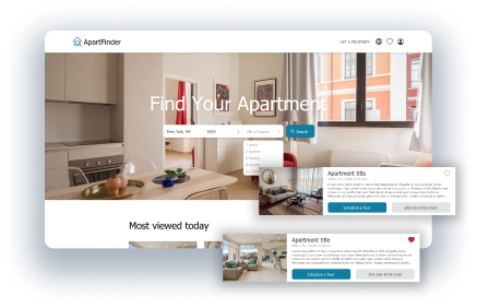
Apartment Finder Website Case Study
My role
UX Designer leading apartment finder website design (personal project)
Responsabilities
Conducting user research, paper and digital wireframes, low and high fidelity prototypes, usability studies, responsive design, information architecture...
Project duration
September 2021
The Problem:
Busy students and professionals need a quick and reliable way to find a new apartment when they need to move.
The Goal:
ApartFinder goal is to make the process of finding an apartment efficient and straight to the point by providing an intuitive and functional experience.
The product:
ApartFinder is a website that allows people to find an apartment quickly and efficiently, based on the user's specific wants and needs.
Understanding the user
I conducted user interviews to understand who are my users and what are their needs, desires, and behavior. I discovered the process people follow when searching for an apartment, what do they need to know, and what they are looking for.
Finding an apartment is a challenge. The goal of this research was to understand that challenge, so that I can make better design decision and create an experience that is useful to people.
Pain points
Time
When looking for an apartment in a hurry, people need to find and access what they need quickly. The user flow should be concise and to-the-point.
Precision
Picking an apartment is not an easy task. There are multiple important choices and criterias. Users must be able to precisely indicate the apartment they are looking for.
Authenticity
On some platforms to find an apartment, there are fake fraudulent listings, which can deceive and hurt the user. Users need to feel confident and safe when looking for an apartment.
Persona
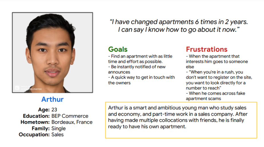
Arthur is a busy student and employee who needs a fast, reliable, and effortless way to find a new apartment because he needs to find a new place to live in quickly.
User journey map
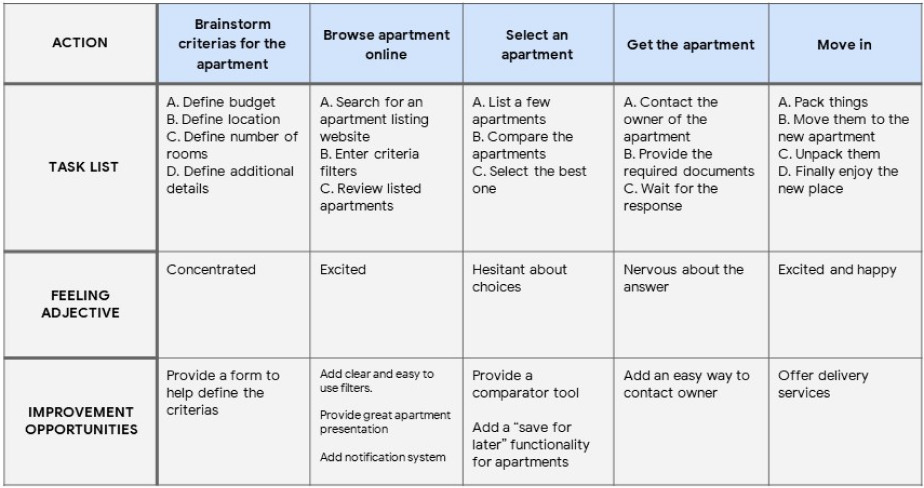
I created a user journey map of the typical user flow, from browsing apartments to movin in. It helped me identify possible pain points and improvement opportunities.
Starting the design
Sitemap
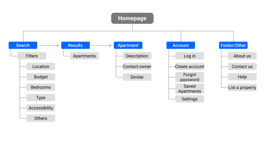
The website sitemap highlight a sequential structure, starting with the search page to the result page, and then the apartment page with the contact options. The goal is to keep the user flow simple, while complete so that users can can accurately indicate what they are looking for, and find it.
Paper wireframes
I started doing my wireframes on paper, allowing me to quickly iterate and try out different layouts and composition. It was crucial to keep in mind the multiple needs and pain points of the users while designing each screen.
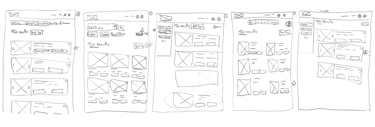
Screen size variations
Because ApartFinder is a website designed to be usable on all devices with internet access, I worked on additional screen sizes to make sure the site would be fully responsive.
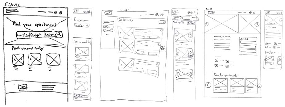
Digital wireframes
Moving from paper to digital wireframes was helpful in bringing the basic structure of the pages to life.

Low-fidelity prototype
To create a low-fidelity prototype, I connected all of the screens involved in the primary user flow of searching and finding an apartment, and contacting the owner.
After completing the low-fidelity prototype, I need to know how easy or difficult it is for users to use it and complete the main user flow.
View the low-fidelity prototype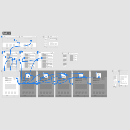
Usability study findings
These were the main insights I’ve gained from the usability study:
Search
When starting a search, users would prefer to specify the number of rooms, instead of the number of bedrooms.
Filters
Users would like to have more advanced and specific filters, like elevator and balcony, to indicate more precisely what they are looking for.
Information
When browsing through the apartment page, users would like to have a more precise understanding of where the apartment is located.
Refining the design
Mockups
When creating the mockups, I improved the user experience based on the insights from the usability study. One of the changes I made was creating more advanced filters so that users could indicate more precisely what they are looking for.

One of the insights was that users would like to know more precisely where the apartment was located, so I added a map to the apartment page.
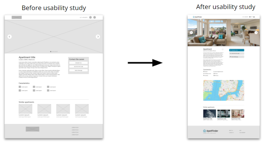
High-fidelity prototype
The high fidelity prototype followed the same user flow as the lo-fi prototype, while implementing the feedback and insights from the usability study to better satisfy the wants and needs of users. It is an honest and realistic preview of what the final product would look and feel like.
Accessibility considerations
1. Users with disabilities can use filters to specify their needs. For example, disabled people can search for apartment with handicap access.
2. Users can access the website from a variety of devices, and the site is available in multiple languages.
3. I used landmarks to help users navigate the site, including users who rely on assistive technologies.
Going forward
Takeaways
Impact
In the overall, I received mostly positive feedback about the project. Some participants told me that the website met their needs very well, and that it was even better than some they visited.
What I learned
I learned about the search/find design concept, I mean allowing users to specify what they are looking for, and responding to that need with content/result that is clear, that contain every information the user is looking for, and that is context-relevant.
Next steps
1. Conduct follow-up usability testing of the hi-fi prototype to help improve on it and validate it.
2. Hand-off the designs to the engineering team to start building the product.