

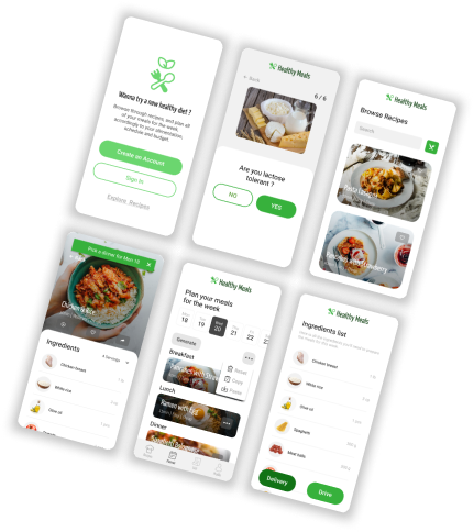
Healthy Meals App and Responsive Website
My role
UX designer leading the app and responsive website design following the design process.
Responsabilities
Conducting user research, paper and digital wireframes, low and high fidelity prototypes, usability studies, responsive design, information architecture...
Project duration
October 2021
The Problem:
Everybody want to eat healthy, but some people face challenges and pain points that prevent them from actually eating healthy meals consistently, whether it’s tight schedule, lack of energie, or limited knowledge on the topic.
The Goal:
Design an easy-to-use tool that will help people find healthy meals recipes accordingly to their needs, and help people plan their meals for the week all at once.
The product:
Healthy Meals is an app and website focused on helping people cook healthier meals. Healthy Meals’ primary target are working adults looking for an efficient and effortless way to adopt a healthier diet.
Understanding the user
The two main goals of user research were to understand what are the challenges people face when trying to adopt a healthier diet, and what are the specific needs each people have regarding their own nutrition. I developed interview questions to help me understand my users, the challenges they face, and their own specific needs.
Persona
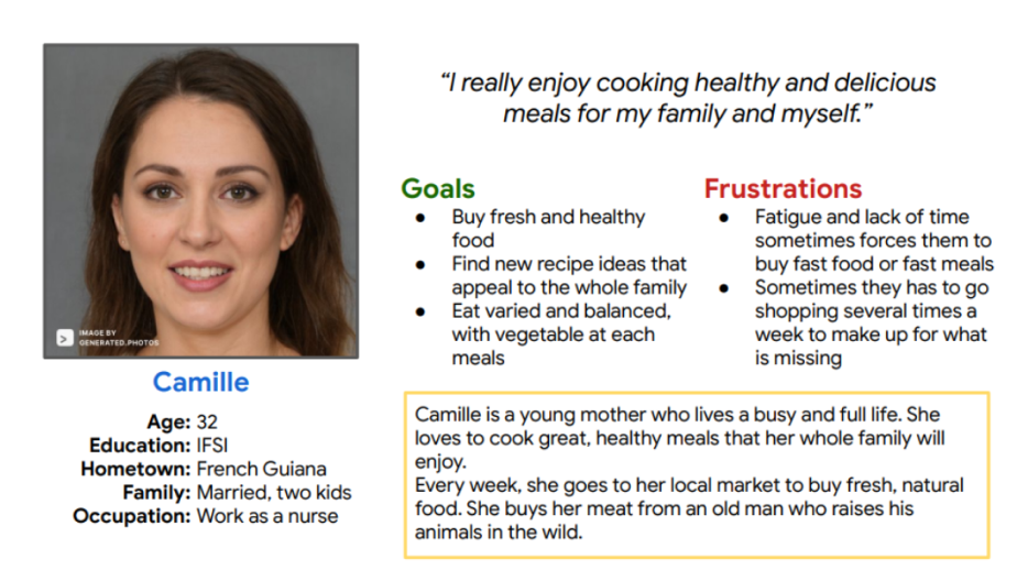
Camille is a working mother of two who needs to find new delicious healthy recipes so she can cook good food that appeal to the whole family.
Ideation
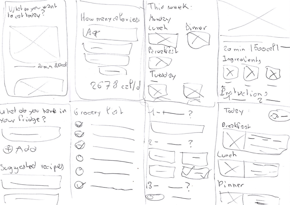
I did a quick ideation exercise to come up with potential ideas and solution to solve the user problem. My focus was specifically on meal planning and recipes adapted to specific user needs.
Starting the design
Digital wireframes
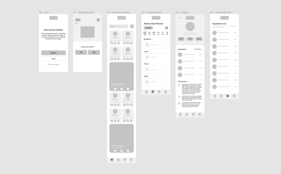
After ideating on possible solutions, I created paper, then digital wireframes for the Healthy Meals app. These design focused on the main user flow of browsing and finding new recipes, and scheduling meals for the week.
Low-fidelity prototype
To prepare for usability study, I created a low-fidelity prototype that connected the user flow of specifying our specific nutritional needs, browsing through recipes, and planning meals for the week.
View the low-fidelity prototype
Usability study findings
User needs
Some people have allergies and intolerances towards specific ingredients, or don't eat certain food. The app should only offer recipes that meet the specific needs of the user.
Planner
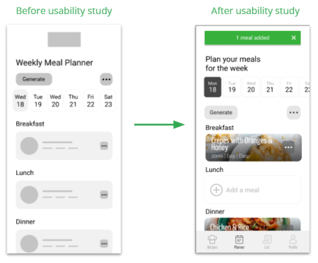
People had difficulty adding new meals to the weekly planner, or had poor indication of it they succeded.
Time & Effort
People would like to have a feature that allows them to generate weekly meals plan, to speed up the process and save time and effort.
Refining the design
Mockups
I iterated on previous wireframes and created mockups taking into account the insights from the usability study. One of the most important changes needed was to provide clear indication when users added new meals to the weekly planner.
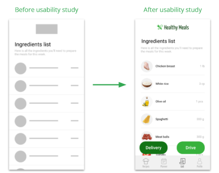
Additional design changes included adding an option to have all the ingredients necessary for the meals of the week ready for delivery or drive.
High-fidelity prototype
The high-fidelity prototype followed the same user flow as the low-fidelity prototype, including design changes made from insights of the studies.
Accessibility considerations
1. The main accessibility considerations was to make sure that each user be offered recipes that meet their needs and wants, whether it's a vegan diet or people eating one meal a day. When user register, he is asked a serie of questions that let the app determine what recipes to display.
2. Our end user being people who have tight schedule and limited time dedicated to food planning and cooking, the weekly meal planner include a feature that let suers auto-generate their meals for the week.
Responsive Designs
Sitemap
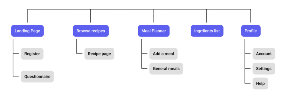
With the app designs completed, I started work on designing the responsive website. I created a sitemap to guide the organizational strcture of the website and ensure a cohesive and consistent experience across devices.
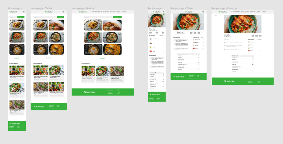
The responsive design included screens for mobile, tablet, and desktop devices. The large width of desktop version allowed for more flexibility, like put the meals of the week side by side when planning meals.
Going forward
Takeaways
Impact
In general, users felt like the weekly planner tool could actually help them simply the process of planning and preparing meals for the week, allowing them to save time and energy when trying to eat healthy meals everyday.
What I learned
I learned to trust the design thinking process and be mindful at each stage of it. When conducting research, I learned to pay very close attention to understand what the user mean and make sure my designs are adapted and accessible to every user.
Next steps
1. Conduct a final round of research (usability study) to find out if the app can be used in real life scenarios without the user facing pain points or difficulty.
2. Hand off the designs to build the app and responsive website and launch it.
3. Keep adding new healthy recipes regularly and stay tuned to issues that users may encounter and report.